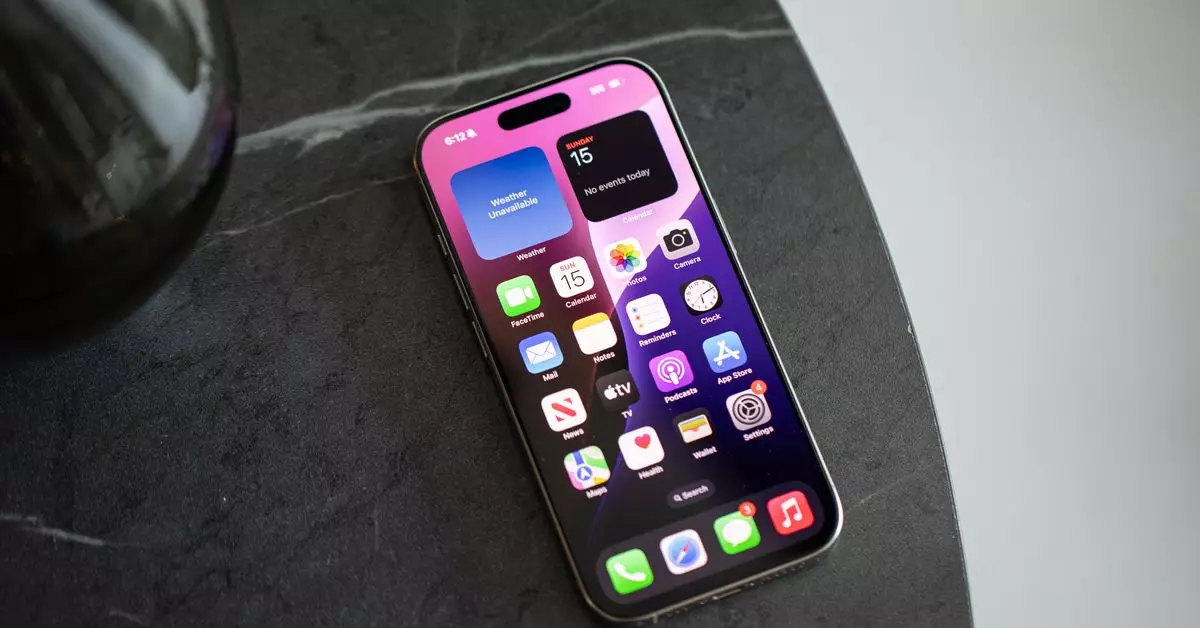
For many smartphone users, the app grid has been a steadfast companion on countless devices over the years. It offers a sense of comfort and familiarity, presenting an orderly layout of icons that most people have relied on since the dawn of smartphones. However, as users accumulate an ever-growing number of applications, this once-inviting grid can swiftly morph into a chaotic visual maze. As I delved into my own experience with mobile devices, I realized that my affection for this traditional layout had become a burden rather than a tool for efficiency.
Staring at dozens of app icons, each vying for my attention, became overwhelming. Notifications adorned these icons like persistent reminders of tasks undone, further contributing to a sense of mental clutter. With over sixty apps now on my iPhone, the simplicity of ten apps seemed like a distant memory. This realization sparked the question: are our devices becoming less functional and more stressful as they evolve?
Historically, Android has offered users the freedom to customize their experience significantly. With the ability to designate an app drawer—a system that keeps the main screen tidy—the approach to app organization is liberating. Users can implement alternate launchers, allowing their homescreen to reflect their unique needs and preferences. In contrast, iOS has remained more rigid, automatically placing newly downloaded apps directly on the homescreen, which can lead to overlay and overwhelm.
The introduction of iOS 14 marked a significant shift in how Apple approached home screen customization. With features like widgets, an app library, and the option to conceal apps, it became possible to break free from the constraints of the grid. However, despite these innovations, many users found themselves defaulting back into familiar organizational patterns, unable to fully embrace the new options available to them.
With the release of iOS 18, Apple has amplified this customization potential, allowing users to arrange apps and widgets freely on their homescreens. My curiosity prompted me to finally explore this new flexibility, considering whether I could redesign my digital space to minimize distraction and improve my productivity.
I dedicated an hour to purge my app lineup, reminiscent of a spring cleaning ritual for the digital age. The process began with a sobering realization: why should an app I hardly used occupy prime real estate on my homescreen? Unused icons cluttered my view, demanding attention without fulfilling a meaningful purpose. I removed unnecessary applications and consolidated functionality into a more streamlined experience.
After my endeavor, I transitioned from an overwhelming layout filled with folders and emojis into a much simpler setup featuring just four essential apps and an array of thoughtfully placed widgets. I jokingly dubbed this arrangement “Windows Phone 2.0.” Although I felt a twinge of apprehension about my new frugality, the fear quickly melted away as I discovered the benefits of this newfound simplicity. Instead of exhausting minutes hunting for that elusive app, I significantly relied on Siri’s suggestions, transforming my interaction with the device.
Yet, my experience illustrated a fundamental trade-off. With fewer icons to lure me in, I discovered that notifications slipped through the cracks. Dismissing alerts has become a double-edged sword; with fewer badges to nag me, I sometimes overlook important updates. Nonetheless, this newfound approach invigorated my digital space, freeing me from the compulsive need to address every single notification immediately.
The minimalistic approach has garnered attention from several of my colleagues as well. For instance, Wes Davis epitomizes the ‘off-grid’ philosophy, wielding his iPhone as a tool for productivity rather than a source of distraction. His homescreen reflects simplicity, featuring only a handful of shortcuts to key actions and a select few essential apps. He stressed that decluttering his device has significantly contributed to a less chaotic relationship with technology.
Similarly, my colleague Jay Peters utilizes a pared-down version of the homescreen, only showcasing a handful of apps. This method enables him to prioritize the applications he truly engages with while effectively lightening his visual load. Their strategies demonstrate that many individuals are inching closer to a balanced digital life, highlighting that simplicity is not merely for tech enthusiasts but rather an approach worth embracing by all.
As I navigated my journey through decluttering and simplifying my homescreen, I felt encouraged by the advancements in AI and personalized tools designed to enhance user experience. Apple’s improvement in intelligent app suggestions hints at a future where our devices can truly understand our preferences.
Ultimately, my exploration revealed a powerful truth: an individual need not rely on emergent technologies or futuristic concepts to alleviate the stresses of digital life. By deliberately rethinking our relationships with technology and choosing simplicity, we can reclaim our focus and create environments that foster productivity, mental clarity, and, above all, an enriching digital experience.

